What is Typography for Designers?
Typography for Designers Certificate Program
The Typography for Designers certificate program is a comprehensive, hands-on course that teaches you the art and science of selecting, arranging, and manipulating type to create compelling visual communication. Designed for graphic designers, UI/UX professionals, and anyone who works with text in a visual medium, this program equips you with the practical skills to make informed typographic decisions that elevate any design project. By the end, you will be able to confidently choose typefaces, establish clear visual hierarchies, and apply advanced typesetting techniques to produce professional-grade work.
The program is structured to be beginner-friendly, starting with the anatomy of type and classification systems before progressing into layout, spacing, and color theory. You will build core competencies across five key areas: type anatomy and classification, visual hierarchy and layout, spacing and alignment, digital typography, and expressive typography for branding and motion. With a strong emphasis on both theory and real-world application, this course ensures you develop a versatile skill set that is immediately applicable in today’s design landscape, where typographic excellence is a critical differentiator.
What is Typography for Designers?
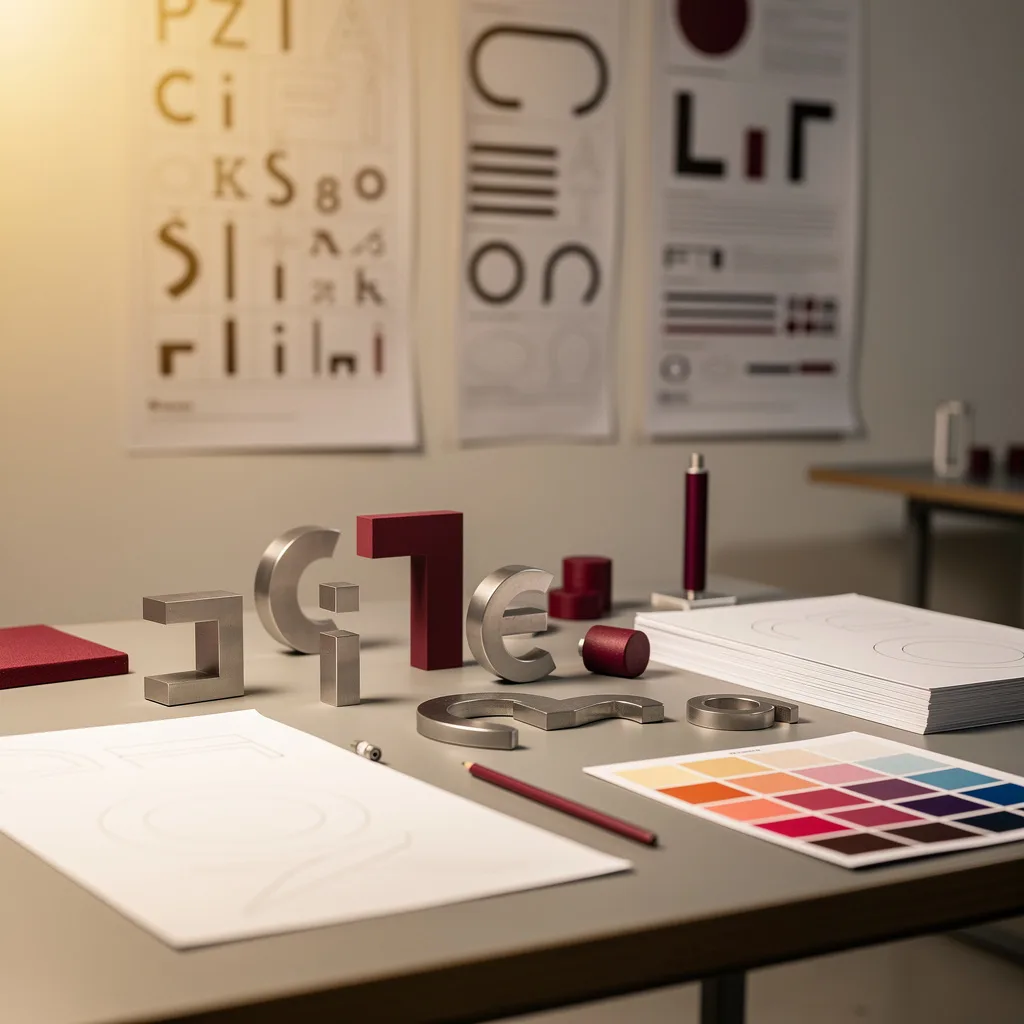
Typography for Designers is the study and practice of using type as a primary visual element in design. It covers everything from the anatomy of letterforms and classification of typefaces to the principles of spacing, alignment, and hierarchy that govern how text is read and perceived. Core concepts include kerning, tracking, leading, grid systems, and the expressive potential of type in both static and motion contexts.
In today’s digital-first world, typography is more important than ever. With the explosion of web and mobile interfaces, branding, and content marketing, designers must master typography to ensure readability, accessibility, and emotional impact. Recent shifts toward variable fonts, responsive typography, and kinetic type have made this skill set essential for staying current in the industry.
Mastering typography builds a versatile skill stack that includes visual hierarchy, layout design, color theory, and brand communication. This knowledge is directly applicable in fields such as graphic design, web and app design, advertising, publishing, and motion graphics. Whether you are creating a logo, a website, a poster, or a video title sequence, a deep understanding of typography empowers you to communicate more effectively and create work that stands out.
Common Questions About Typography for Designers
Will the certificate help me build a stronger design portfolio?
Can I apply typography skills from this course to web design?
What is the difference between kerning and tracking in typography?
How do grid systems help create better typographic layouts?
What are OpenType features and how can I use them?
- Ligatures: Connects letter pairs like "fi" or "fl" for smoother reading.
- Alternate characters: Offers stylistic variations of letters.
- Small caps: Creates uppercase letters at lowercase height.
- Oldstyle figures: Provides numbers with varying heights for a classic look.
What is the anatomy of a typeface and why does it matter?
Is serif always more readable than sans-serif for body text?
What Will This Course Bring You?
- Identify and classify typefaces by anatomical features and historical categories to inform design choices.
- Evaluate typeface characteristics to select appropriate fonts for specific design contexts and communication goals.
- Design visual hierarchies using typographic scale, weight, and spacing to guide reader attention effectively.
- Apply kerning, tracking, and leading to enhance readability and visual balance in text.
- Implement grid systems and alignment techniques to create structured, cohesive layouts for multi-page documents.
- Analyze color theory principles to select harmonious type and background combinations for legibility and mood.
- Implement responsive typography techniques to ensure optimal readability across various screen sizes and devices.
- Create expressive typographic compositions that convey emotion and meaning through unconventional letterforms and layouts.
Curriculum
12 Units1. Type Anatomy and Classification
1 hour
2. Choosing Typefaces for Design
1 hour
3. Visual Hierarchy and Layout
1 hour
4. Kerning, Tracking, and Leading
1 hour
5. Grid Systems and Alignment
1 hour
6. Color and Typography
1 hour
7. Typography for Digital Design
1 hour
8. Expressive and Experimental Typography
1 hour
9. Typography for Branding
1 hour
10. Advanced Typesetting and OpenType Features
1 hour
11. Kinetic Typography and Motion
1 hour
12. Final Project and Critique
1 hour
Exam – Typography for Designers
20 Questions • 70% Pass • 30 min
Unlock All Units for Free
Create an account, enroll in the course, and start with the first unit right away.
Exam – Typography for Designers
20 Questions • Pass: 70% • 30 min
Course Duration
720
Total Minutes
12
Unit
1
Final Exam
~60
Min / Unit
Typography for Designers Certificate Program
Document Your Skill
Those who pass the 20-question, 30-minute exam with 70% receive the Typography for Designers Certificate.
Stand Out on Your CV
By adding your certificate to your CV, gain a professional reference in job applications and stand out from the crowd.
Career Advantage
With the verification code, employers can check your certificate instantly — a concrete way to show your growth.
CERTIFICATE FEE
At the end of the course, an online exam consisting of 20 questions with a 30-minute time limit is given. The exam appears automatically after you complete the topics. Anyone who scores at least 70 out of 100 on the certificate exam is awarded the Typography for Designers Document (certificate of attendance). You can add the certificate you earn to your CV for job applications in the many sectors listed above, and use it as a reference proving that you took this interactive course.
The Certificate of Achievement you receive with the Typography for Designers course program holds value that proves your personal and professional development in the business world. By adding it to your CV, it can serve as an important reference in your job applications. Moreover, compared with certificates from other private training institutions, Catch Wisdom certificates are offered to our participants at a much more affordable price.
The Typography for Designers course certificate is a document that proves, with a unique verification code, that you completed the course. Employers can instantly check its authenticity with this code, which helps you show your development concretely in your job applications.
For more information, we recommend visiting the Support page.
Certificate in 7 Languages
Earning success certificates from our courses is now more meaningful and global. With certificates available in Turkish, English, German, French, Spanish, Arabic, and Russian, we fully unlock the potential of students worldwide.
Why Certificate in 7 Languages?
-
01
Global Skill Development
Receiving your certificates in 7 different languages strengthens your communication skills as you engage with more people worldwide. It lets you operate more confidently and capably on the international stage.
-
02
International Job Opportunities
Employers may see your certificates in multiple languages as a sign of your ability to seize global opportunities. You can open more doors to new jobs and projects.
-
03
Cultural Richness
The chance to earn certificates in different languages helps you build closer ties with various cultures and broadens your worldview. It enriches your global perspective and deepens cultural understanding.
-
04
Ability to Participate in International Projects
Multilingual certificates give you an edge to work more effectively on international projects. They boost your chances of leadership and participation in diverse projects in the business world.
-
05
Prove Yourself on the Global Stage
Certificates in multiple languages give you the opportunity to present your skills and knowledge worldwide.
Language diversity opens worldwide opportunities. If you want to prove yourself in the international arena, join our online Typography for Designers course program and begin this journey with us.
Frequently Asked Questions (FAQ)
Is this course paid?
How do I join the course?
Can I take the course at my own pace?
How can I get my certificate?
What are the advantages of the certificate?
Boost Your Career
Take a new career step with the Typography for Designers course. Add your certificate to your CV, stand out in job applications, and open the door to new opportunities in the industry.
StartStudent Reviews
No reviews yet
Enroll in this course and be the first to leave a review about your experience with Typography for Designers.
Start